
When you hear the name chocolate rivers, colorful candy, playful inventions, and of course, the famous Willy Wonka himself. Over the years, the Wonka brand — inspired by Roald Dahl’s classic book Charlie and the Chocolate Factory — has built a strong connection to imagination, fun, and indulgent sweets. But as times change, even iconic brands need a refresh.
In this article, we’ll take a closer look at the latest redesign of the Wonka logo: what changed, why it changed, and how this redesign balances modern branding with the playful magic that defines the Wonka name.
Before we explore the new design, it’s helpful to understand where the brand was.
The previous Wonka logo featured:
A highly decorative, whimsical design
The famous “W” with a swirling curl — meant to reflect the brand’s sense of wonder.
The word Wonka in playful, somewhat irregular typography.
Often paired with vibrant colors like purple, which has long been associated with Wonka products.
The old logo emphasized childlike fun, fantasy, and creativity. But it also leaned heavily into the “candy store” vibe — great for kids’ products, but limiting when the brand wanted to broaden its appeal or mature its image for a wider audience.
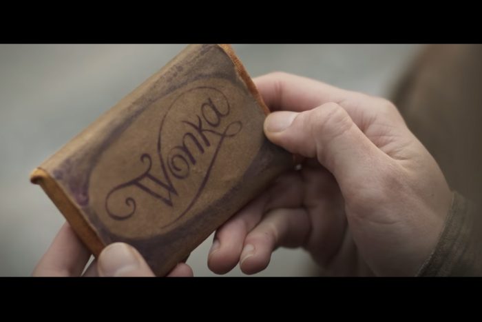
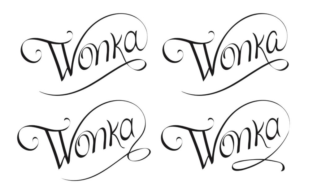
As brands evolve, their logos need to keep up with new markets, new products, and new audiences. The Wonka brand — now part of Nestlé and used by Warner Bros. for film adaptations — needed a refreshed visual identity that could work across:
Candy products (of course)
Movie merchandise
International markets
Digital platforms (websites, social media, apps)
Broader retail partnerships
The goal was to create a logo that still felt magical and fun, but that also looked more polished, versatile, and timeless.
The updated logo keeps some key elements from the original — but refines them in very deliberate ways:
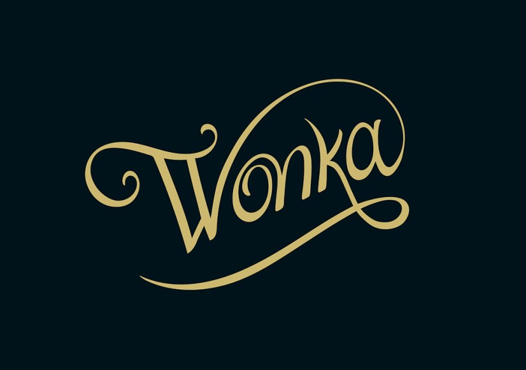
The large, swirling W is still front and center.
But now the swirl feels more elegant and better balanced.
The new design reduces the overly decorative style and creates a more sophisticated shape, which is still playful but easier to reproduce across different media.
The word Wonka now uses a more traditional serif font.
Serif typefaces (the ones with little “feet” at the ends of letters) are often associated with heritage, authority, and quality.
This change helps link the Wonka brand to its literary roots in Roald Dahl’s beloved book, while also making the logo feel more upscale.
The famous purple color is still used, but often in a more muted, sophisticated shade.
By reducing the number of loud, competing colors, the logo becomes easier to use across packaging, merchandise, and digital formats.
The new logo works better when resized for small applications (like mobile apps or social media icons).
The simpler design is more legible at smaller sizes and adapts well to both flat and 3D renderings.
This flexibility is critical for a global brand that needs consistent identity across hundreds of platforms.
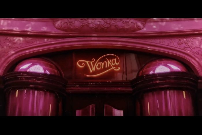
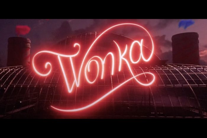
This new logo successfully:
Keeps the heart of the Wonka brand alive (imagination, magic, and fun)
Matures the brand for broader appeal — kids, adults, international markets
Aligns with modern design trends — minimalism, clean lines, and scalability
Creates longevity — this design will hold up better for years to come

For designers, marketers, and brand strategists, there are several key lessons from this redesign:
Evolution, not revolution: The new logo doesn’t abandon the old entirely — it refines what already worked.
Balance playfulness with professionalism: Even playful brands benefit from sophistication when expanding to wider audiences.
Think about all platforms: A good logo needs to look just as strong on an iPhone as it does on a billboard.
Stay true to your story: Wonka’s brand identity remains rooted in creativity and magic — the logo still communicates this clearly.